If you’re a first time entrepreneur with a game changing idea, what’s the first thing you do?
Business Plan? Nope. Figure out how to get money to get your idea off the ground? Nah. Start building a prototype? Hell no.
So, what is it?
Your company name, domain, and logo… of course!
Like most entrepreneurial virgins, I was no different. I spent months thinking of ideas for a logo and a company name with a ‘.com available’ before I even attempted to sketch my first UI mock. It was ALL I cared about.
In hindsight it seems like such a waste, but now I think it’s a right of passage for any first time entrepreneur.
Those initial days, months, even years (as in our case) before you get your first paying customer are fragile…so so fragile. The only things driving you during this time are raw emotion and sheer will. Your company name and logo serve as your symbol of hope-a rallying cry for when things get tough.
So, it’s ok, obsess about it in the beginning. It’s all a part part of the journey. Just be warned all that hard work will be thrown out multiple times as your product matures. If you’re one of the lucky ones, those initial ideas will be the seeds of what may eventually become your brand.
Here’s a picture history of iorad’s brand evolution. You might want to scroll past 2007, it’ll hurt your eyes.
2007
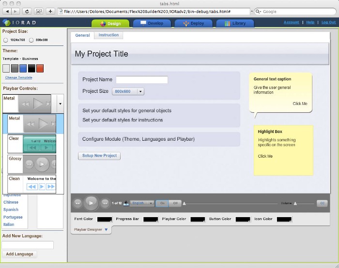
2012
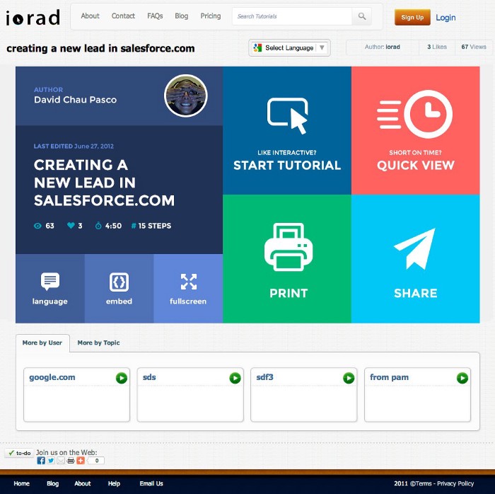
2013
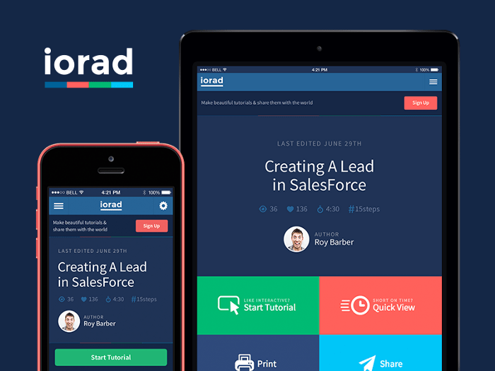
2015
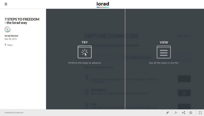
2018
Subtractive Art is the process of removing material to create a finished work, for example, stone carvings.
Our goal was always simplicity. You can see with each version we took tiny steps toward that goal. Slowly chipping away at the 2007 blob until we reached the crossroad of simplicity street & elegant road. Do I sound like proud father? Hell yeah, I am.
Why am I telling you all this? Because we have an important announcement. The capture icon that you are familiar with in your browser tool bar is changing.
From:

To this:

Simple.
Bold.
And dare I say, permanent brand.
We’ve probably spent an obscene amount of time and money on all the redesigns throughout the years, and we’ve ended up with a logo that a four year old could’ve drawn in 10 seconds.
Why a pink box?
Our lead designer, Artem, sent this to me for the first time late last year. He was so excited. He had this eureka moment. I hated it and shelved it. He came back again a month ago and was relentless. The more I thought about it, the more it made sense.
NOW, it feels just right.
The foundation of iorad and the core of a tutorial is the highlight box- the tool that tells you what to focus on, while drowning out all the noise.
Remember the 4 year old that made this in 10 seconds…simple and fast just like making a tutorial.
And, that pink. Ohhhhh that pink. It’s exciting, it’s bold, and it’s my favorite Sharpie highlighter color.
All this time we’ve been working on a tool that thinks outside the box, who knew the foundation of iorad would actually be… THE BOX.
Keep a look out for it in your browser toolbar. Same app. New simple and bold look. Let us know what you think.